
Running machine learning models on tiny hardware is all about trade-offs. Since clock cycles and memory are limited, TinyML developers often have to decide whether to trade model accuracy for improved performance or reduced memory use.
One way of doing this is through model optimization. For example, the model optimization technique known as post-training quantization involves reducing the precision of a model’s internal representations, so that it occupies less ROM and is faster to compute.
However, depending on the type of model, this optimization can come at the cost of model accuracy. Whether this cost is within an acceptable range depends on the individual situation, so it’s difficult to have a hard and fast rule for whether a particular optimization should be used.
While we can’t make these decisions for our users, our goal at Edge Impulse is to make these types of decisions as easy as possible. To coincide with adding Arduino support, we’ve added a new feature. When deploying their model, developers now see a summary of all the optimizations that are available to them, along with the critical information they need to know:
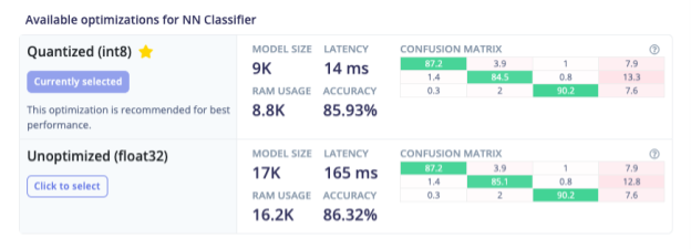
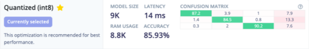
First up, we take a shot at recommending one of the models based on its expected performance on-device. Most of the time, the recommended model will be the best choice. But under certain constraints—for example, if accuracy is critical, the developer might need to make another choice.
To help with this, we provide both the overall model accuracy as a percentage and a visual representation of how the model is performing on test data. This comes in the form of a confusion matrix heatmap, which indicates what percentage of test data samples are being classified correctly versus mislabelled into a different class:
At a glance, you can see that the model is performing well—most of the confusion matrix cells are green, though there are some misclassifications. If you need more information, you can hover the cursor over a cell to view the nature of the misclassifications:
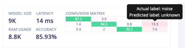
In this case, we can see that the label with the highest rate of misclassification is “noise”, which the model is frequently unable to confidently identify, leading to an “unknown” label. It turns out that for our use case, this is perfectly acceptable.
It’s very easy to compare the quantized model’s heatmap side by side with the float32 version:
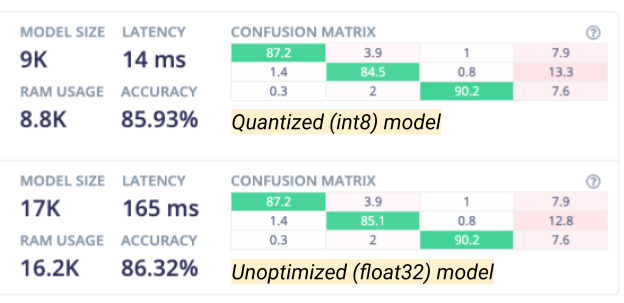
We can see at-a-glance that the performance is broadly similar, and although there are slightly more misclassifications by the quantized model, they are made up for by a much-improved model size, RAM usage, and latency. This means we can confidently deploy the quantized model in the knowledge that it is performing well.
Building machine learning applications often involve these types of trade-offs, and data visualizations are an effective way to give developers the insights they need to make complex engineering choices. We plan to make use of these types of data visualizations to empower embedded developers to build effective and high-performance machine learning applications.
To get started with Edge Impulse, check out our tutorials for continuous motion recognition and audio classification. You don’t need any hardware or a dataset to get started—you can collect data and deploy a model with any modern mobile phone.
Daniel Situnayake is a Founding TinyML Engineer at Edge Impulse.